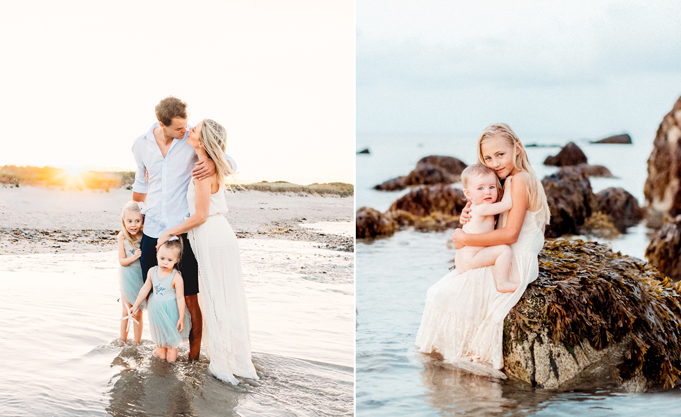
This is a photograph I took on Cape Cod last summer and then and did some Photoshopping to make it look like a painting. I love it so much–I think I’ve found the new piece of original artwork for over our living room mantle! Thinking of getting it printed very large and on a gallery wrapped canvas!! I’ve seen the color palette done before on design blogs and think it’s lovely so I thought I’d give it a whirl. Just a little something different for the blog…what do you think? Still so, so much to blog…I got my office cleaned up and orders packaged so now I feel like I can breath again. Stay tuned for some really yummy images. xoxo


Debra - So, so love this!
Natalie Clayshulte - Love the color palette as well as the idea to make it your living room mantel piece. It could really inspire the entire room and give it a terrific vibe.
Stacy Schurman - Very cool! I would love it on a blue wall!
Sandra Bludau - You nail it every time. Everything that you do. Your consistency is a huge inspiration and goal of mine! This place is a Joy to visit. : )